

Blog
Mastering the Art of Color Matching: Tips for Painting Contractors in Nairobi
Table of Contents
Painting is an art form that requires not only skill but also a keen eye for color matching. For painting contractors in Nairobi, mastering the art of color matching is essential to delivering high-quality and visually appealing results.
Whether you’re working on residential or commercial projects, understanding the principles and techniques of color matching can elevate your work to the next level. In this comprehensive guide, we will provide you with valuable tips and insights to help you improve your color matching skills as a painting contractor in Nairobi.
The Importance of Color Matching
Painting contractors often underestimate the impact of color matching on the overall aesthetics of a project. The ability to seamlessly blend colors can make the difference between a mediocre job and an exceptional one.
When colors harmonize, they create a cohesive and visually pleasing atmosphere, enhancing the overall appeal of any space. As a painting contractor, mastering color matching not only enhances your reputation but also ensures client satisfaction and repeat business.
Understanding Color Theory
Before delving into the practical tips, it’s essential to have a basic understanding of color theory. Familiarizing yourself with the color wheel and its relationships will provide a strong foundation for your color matching endeavors.
The color wheel consists of primary colors (red, blue, and yellow), secondary colors (orange, green, and violet), and tertiary colors (red-orange, yellow-orange, yellow-green, etc.). Knowing how these colors interact and complement each other will help you make informed decisions when selecting and blending colors for your projects.
The Color Wheel: A Guide for Contractors
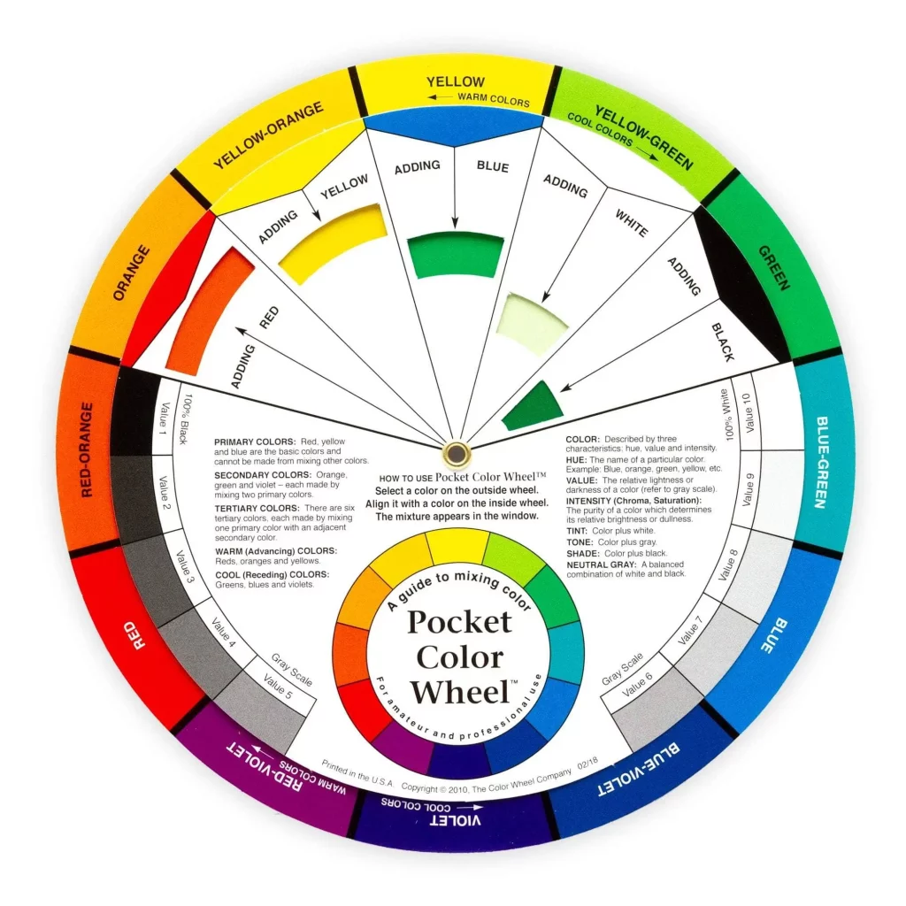
The color wheel is a valuable tool for painting contractors in Nairobi. It helps you identify complementary colors, analogous colors, and triadic color schemes, which are commonly used in interior and exterior painting projects. Here’s a quick breakdown of these color schemes:
Complementary Colors
These are colors that are opposite each other on the color wheel. Combining complementary colors creates a high contrast effect and can be used to draw attention to specific areas or elements within a space. Some complementary colors that you can consider include:
- Blue and Orange: Blue and orange are complementary colors that create a striking contrast. For instance, painting a wall in a deep blue shade and using orange accents or accessories can create a visually captivating focal point in a room.
- Red and Green: Red and green are another complementary color pair that offers a vibrant contrast. By incorporating red and green elements in a space, such as using red furniture against a green backdrop or vice versa, you can create an eye-catching and dynamic atmosphere.
- Yellow and Purple: Yellow and purple form a complementary color combination that exudes energy and liveliness. Consider using yellow as the primary color for a room and incorporating purple accents through furniture, artwork, or textiles to create a visually stimulating environment.
Analogous Colors
Analogous colors are adjacent to each other on the color wheel. They create a harmonious and cohesive look when used together. This color scheme is often chosen for a calming and serene atmosphere. Below are some examples of analogous colors that you can consider.
- Yellow, Yellow-Green, and Green: This combination creates a fresh and natural aesthetic, particularly suitable for spaces that aim to evoke a sense of calmness and serenity. You can use varying shades of yellow, yellow-green, and green in different elements of a room, such as walls, furniture, and accessories, to achieve a cohesive and soothing ambiance.
- Red, Red-Orange, and Orange: The combination of red, red-orange, and orange creates a warm and inviting atmosphere. These colors can be used to infuse energy and create a cozy feel in spaces like living rooms or dining areas. Consider using red as the dominant color and incorporating red-orange and orange as accents or in patterns throughout the room.
- Blue, Blue-Green, and Green: This analogous color scheme offers a refreshing and tranquil vibe, making it ideal for spaces where relaxation is key, such as bedrooms or bathrooms. You can experiment with different shades of blue, blue-green, and green in wall paint, textiles, and decor to achieve a cohesive and serene look.
Triadic Colors
Triadic colors are evenly spaced around the color wheel, forming an equilateral triangle. This scheme offers a vibrant and dynamic look when applied correctly. Have a glimpse of some triadic colors below.
- Red, Yellow, and Blue: The primary colors, red, yellow, and blue, form a triadic color combination. This scheme offers a bold and energetic atmosphere. To incorporate these colors effectively, you can paint one wall in each primary color and use the remaining colors for accents or furniture pieces.
- Orange, Green, and Purple: Orange, green, and purple form another triadic color combination that brings vibrancy and contrast to a space. Consider using one color as the dominant shade, such as painting the walls in orange, and incorporating green and purple through furniture, accessories, or artwork.
- Yellow, Blue, and Red-Orange: This triadic color combination offers a balanced and lively atmosphere. You can use yellow as the primary color and incorporate blue and red-orange through decorative elements like throw pillows, curtains, or artwork to achieve a visually engaging space.
By understanding these color schemes and their applications, you’ll be better equipped to create visually appealing spaces that meet your clients’ expectations.
Tips for Perfect Color Matching
Now that we’ve covered the fundamentals, let’s explore some practical tips to help you master the art of color matching as a painting contractor in Nairobi. These tips will guide you through the entire process, from color selection to application, ensuring impeccable results.
1. Communicate with Your Clients
Before starting any painting project, it’s crucial to have a thorough discussion with your clients regarding their color preferences, desired mood, and overall vision for the space.
This conversation will provide valuable insights that will guide your color selection process. Take the time to understand their needs, offer professional advice, and ensure that both parties are on the same page. If they intend to remodel an existng house, you’ll need to consult the best home remodel content to cover all the angles of the project.
2. Test Colors in Different Lighting Conditions
Colors can appear differently depending on the lighting conditions in a room. Natural light, artificial light, and even the time of day can influence how colors are perceived.
To ensure accurate color matching, test your chosen colors under various lighting conditions. Consider providing samples to your clients so they can visualize how the colors will look throughout the day.
3. Create Color Samples and Mock-ups
Once you’ve selected the colors for a project, it’s wise to create color samples or mock-ups before proceeding with the actual painting. This allows you and your clients to see how the colors interact and whether any adjustments are necessary. It’s easier to make changes at this stage than after the entire space has been painted.
4. Invest in Quality Paint and Tools
Using high-quality paint and tools is crucial for achieving precise color matching. Cheaper alternatives may compromise the color accuracy and overall finish of your work. Invest in reputable brands and reliable tools to ensure consistent and professional results.
5. Blend Colors Seamlessly
When working with multiple cans of paint or different batches, color variation can occur. To avoid visible lines or patches, blend the colors together by mixing them thoroughly. This step ensures a seamless transition between colors and creates a cohesive appearance.
6. Consider Undertones
Colors often have subtle undertones that can affect how they interact with other colors. Be mindful of these undertones when selecting and combining colors. For instance, a warm-toned color may clash with a cool-toned color, leading to an unbalanced and visually unpleasing result.
Frequently Asked Questions (FAQs)
Are there any specific techniques for blending colors seamlessly?
To achieve seamless color blending, mix different cans of paint thoroughly to eliminate color variations. Apply the blended colors in a feathering technique, gradually transitioning from one color to another. This technique ensures a smooth and cohesive appearance.
How do I select colors that complement each other?
Use the color wheel to identify complementary colors or opt for analogous or triadic color schemes. Complementary colors create high contrast, while analogous colors offer a harmonious look. Triadic colors provide a vibrant and dynamic atmosphere.
What should I do if my client is unsure about color choices?
Offer your expertise and provide color samples or mock-ups to help your client visualize different options. Provide guidance based on the client’s preferences, the space’s function, and your professional opinion.
How important is lighting when it comes to color matching?
Lighting plays a significant role in color perception. Colors can appear differently under natural light, artificial light, and different times of the day. Testing colors under various lighting conditions and providing samples to clients can help ensure accurate color matching.
Can I use color matching software or apps to assist me?
Yes, there are numerous color matching software and apps available that can assist you in selecting and matching colors. These tools provide color palettes, simulate different lighting conditions, and help you visualize color combinations.
How can I improve my color matching skills as a painting contractor in Nairobi?
To enhance your color matching skills, start by understanding color theory and the different color schemes. Communicate effectively with your clients, test colors under various lighting conditions, and create color samples or mock-ups before painting the entire space. Investing in quality paint and tools and blending colors seamlessly are also essential for perfect color matching.
Enhance Your Color Matching Skills Today!
Mastering the art of color matching is a valuable skill for painting contractors. By understanding color theory, effectively communicating with clients, testing colors in different lighting conditions, and investing in quality paint and tools, you can elevate the quality of your work and deliver visually appealing results.
Remember to blend colors seamlessly, consider undertones, and offer guidance to clients who are unsure about color choices. At Pioneer Hardware, Ruaka, we provide high-quality paints that produce great results. For more information, don’t hesitate to contact us today.


